|
|
Post by David Okum on Apr 26, 2015 2:49:33 GMT -5
Just giving this a bump!  I have a few items almost ready to ship out for this. I am 80% done the Dark Depths, 70% done with Realm of Shades and 50% done the Mice and Rats add-on sets. Next, it will be the new characters, dragons and dwarf powered armour. I will post more photos tomorrow when I sit down to organize the remaining files. This one is from Realm of Shades.  |
|
|
|
Post by emergencyoverride on Apr 26, 2015 11:44:43 GMT -5
Very nice! Those are awesome! Don't forget to take a break in there for sleep sometime.  |
|
|
|
Post by mproteau on May 5, 2015 20:50:54 GMT -5
Minor comment - the statues in the Lost Treasures set are labeled "Knight Statues" Major comment - I haven't extracted all the pages yet from Props set 3, but it sure looks like some of the layers that adjust colors of objects also *move* the objects ever so slightly. This is going to make it really miserable to make cutfiles that 'just work'. Example - page 5 (fire/light markers) - toggle between the "base" and "bonus alternative 3" layers. Pretty sure those orbs in the lower-right are not aligned the same. On the next page (beds) I pulled the layers out into GIMP and yeah - the beds don't seem to be staying in the same place. If this is something that can be avoided in the future, please do! It's not the end of the world with regards to cutfiles for the set. I'll make the cutfiles and publish them with the caveat that you'll really need to pay attention to whether the cutlines line up, or if they need to be nudged around a bit. |
|
|
|
Post by David Okum on May 6, 2015 6:20:55 GMT -5
Ah jeez, that's not cool. I hope that is the worst of it. I know that the set gave me some trouble when I was putting it together (files were corrupted, not saved properly, etc.) and it was cobbled from what remained. My apologies. I will attempt to be more mindful of my cufile friends in the future. If I have a bit of time I will see if I can alter this set to conform.
Thanks for the keen eye!
|
|
|
|
Post by mproteau on May 6, 2015 8:15:06 GMT -5
I'm not sure it's worth taking away from your time - you've got so much on your plate already. I just wanted you to be aware that this sort of thing complicates the use of cutfiles.
If you want to update the layout and have some raw materials I could work with, I'm sure I could clean things up in a suitable manner. Alternatively, I could simply work from the existing PDFs, slide things around, and rebuild PDFs.
But like I said, I can just publish the cutfiles with the caveat that the user of them may have to nudge some of the bits around.
|
|
|
|
Post by David Okum on May 31, 2015 13:06:50 GMT -5
Jeez, I thought the Dark Depths was coming together faster than these mice, but this is coming sooner than the latter. Attachments:
|
|
|
|
Post by David Okum on Jul 27, 2015 16:04:21 GMT -5
|
|
|
|
Post by emergencyoverride on Jul 27, 2015 21:47:37 GMT -5
And quite smashing! Pics in a day or so!
|
|
|
|
Post by David Okum on Aug 17, 2015 16:20:57 GMT -5
|
|
|
|
Post by furfle on Aug 18, 2015 7:09:03 GMT -5
I received an email regarding an update for realm of shades - is this about the .PDF for the statue? I just added it myself; is there anything else?
|
|
craig
New Member
 Daishō is done, Blood Eagle is the next Ministry Game. Also I have just released Dead Simple 5th Ed.
Posts: 6 
|
Post by craig on Aug 18, 2015 8:24:32 GMT -5
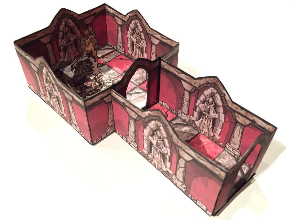
Dave, is the whole new set red with the skeletal statue motif on the walls, or are there layers to vary the colours etc?
|
|
|
|
Post by mproteau on Aug 18, 2015 9:49:53 GMT -5
I just pulled open the walls, and I am seeing red. Ok. That sounded harsh.
Yes - the walls are all red. What other colors might interest you?
|
|
|
|
Post by David Okum on Aug 19, 2015 23:12:54 GMT -5
The new set is red, yes. It was the original colour planned for the set, but I'm not opposed to other colours. To be honest I just thought, "These walls will be red" and never thought about it after that.
The statue was goofed extension wise and there was an opponent card without a name. Other than that, I think that's it, except for a wacky layering issue with the opponent and character cards due to some post play test shenanigans.
|
|
|
|
Post by furfle on Aug 20, 2015 3:50:20 GMT -5
I didn't notice the oppent card thing. The red is fine I think, and is an outstanding choice! The simple fact that you encourage ppl to modify it is cool ... Bash it up y'all :-D I really like the Spector.
|
|
|
|
Post by mproteau on Aug 25, 2015 13:17:34 GMT -5
Speaking of colors... I had the walls open in GIMP (pulling the pages out of the PDF for making cutfiles) and I found the following fun facts:
1) From the original image... Colors > Threshold... set the lower bound to about 77, and you've got a REALLY cool looking black-and-white wall.
2) From the original image... For quick colorization, Colors > Hue-Saturation... and select the red (R) as the color to adjust. That does a fine job of just modifying the wall colors to whatever you want. Sure, it gets some of the stone colored, too, but if you wanted QUICK, you got it! If you want, you can always spend more time creating a mask for the region to colorize, or simply create a second layer that you change the color on and work on erasing the stuff you don't want to change the color of...
|
|